Infinity Royal Treatment is a compassionate and dedicated cleaning company that provides a range of services, including residential and commercial cleaning, lawn care, and junk removal. Their mission is to support individuals with physical and emotional disabilities, as well as the elderly, by creating clean and comfortable living spaces that they can truly call home.
>Goals
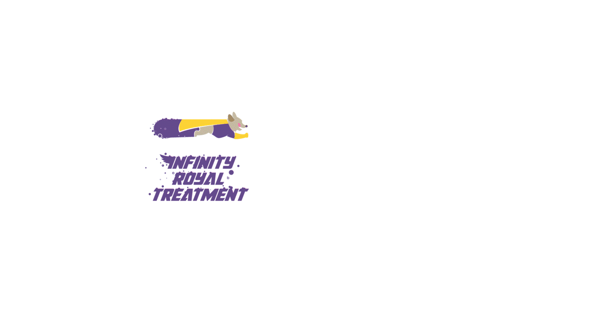
Logo
Create a logo and website that effectively communicate the brand's mission, services, and values.
Reflect the values of joyfulness, personalized care, trustworthiness, community engagement, going the extra mile, and professionalism with a friendly touch through their visual branding
Website
Create an informative site that communicates the main details about the brand and its services
Establish a strong online presence to engage with the community and foster trust

/Challenges
Logo and Website
+ Balancing professionalism and approachability: Striking the right balance in the logo and website design to showcase the brand's professionalism while maintaining an approachable and friendly image.
+ Creating a memorable and relatable character that conveys the brand's purpose of cleaning and helping individuals who are unable to do it themselves.
+ Selecting suitable colors, fonts, and shapes that align with the brand's values and evoke emotions of joy, trust, and professionalism.
+ Developing a website that effectively communicates the brand's values, showcases the services, and encourages community engagement.
+ Representing the brand's voice and engaging the community.
Solut!ons
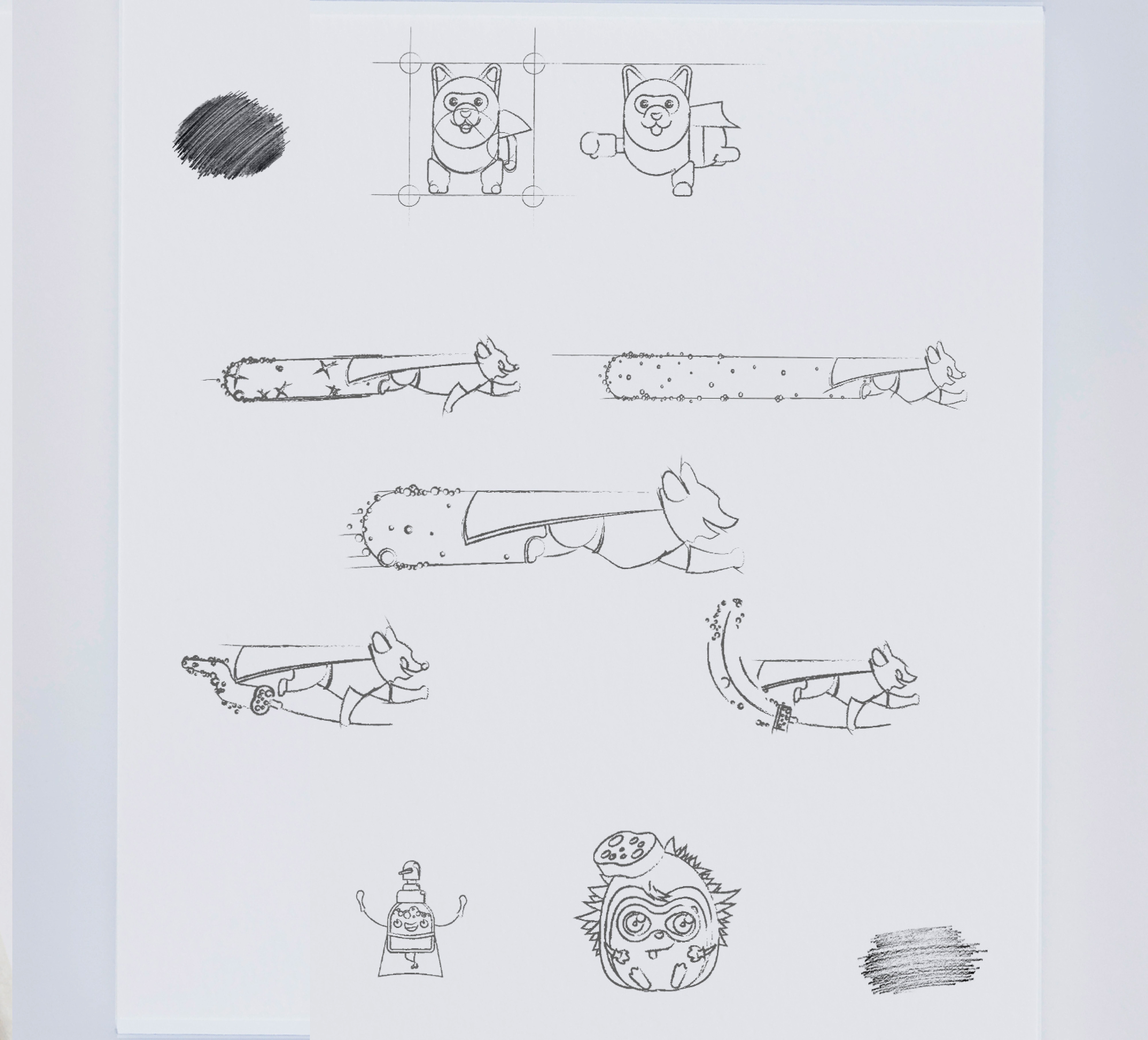
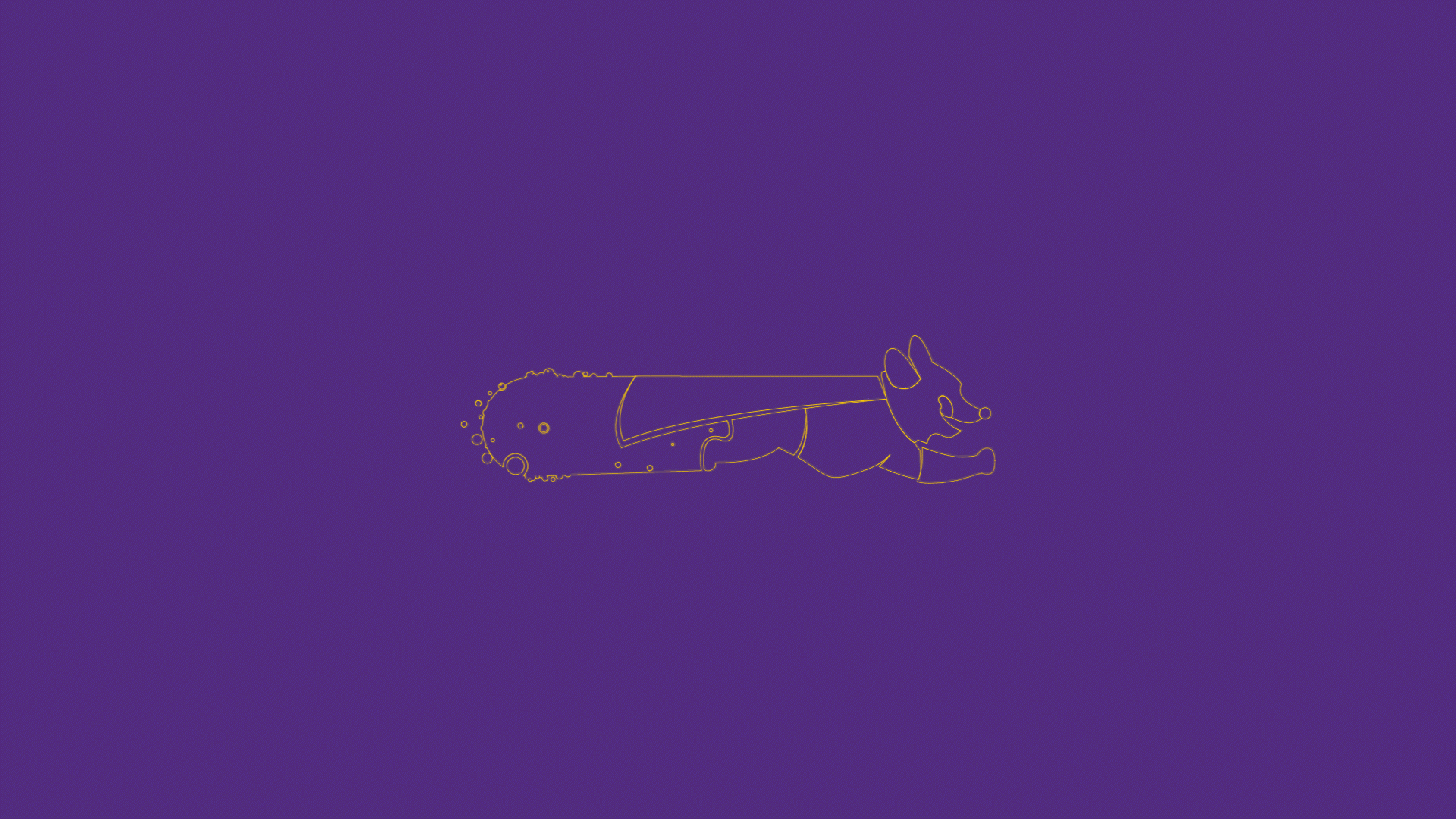
Logo
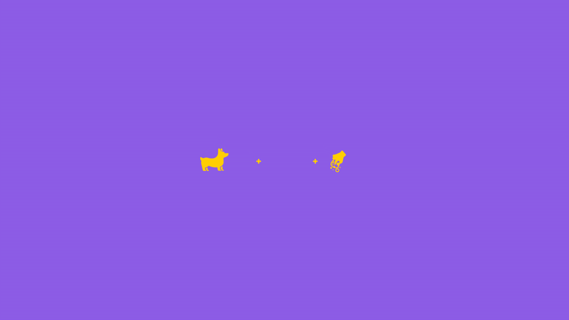
+ We designed a sweet superhero dog character in the logo to create a friendly and approachable image that aligns with the brand values.

Solut!ons
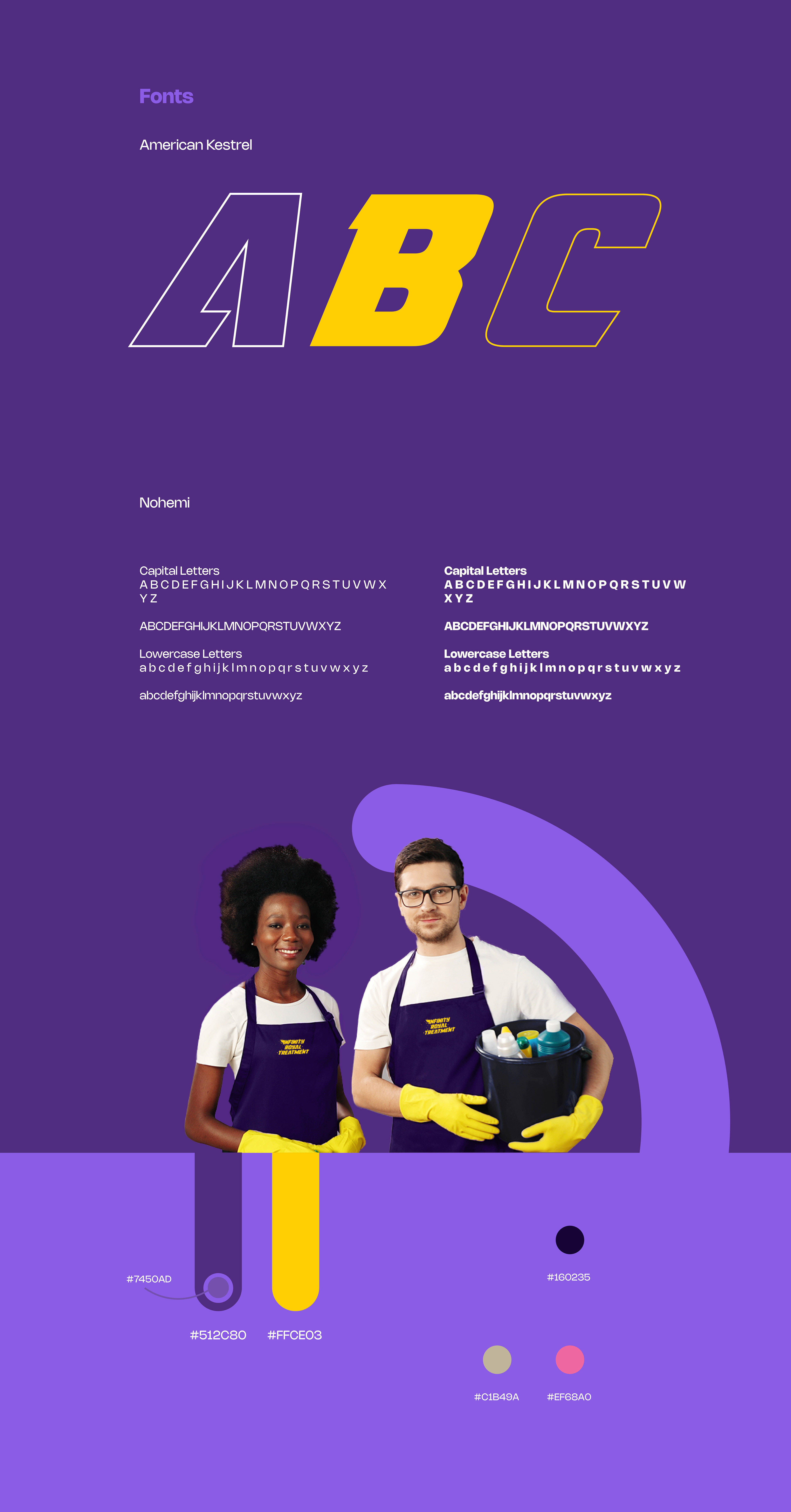
Font Selection:
+ The American Kestrel Font: with its boldness and dynamism, reinforces the concept of superheroes, speed, power, and going above and beyond for the clients.
+ The Nohemi Font: complements the American Kestrel Font with its clean and modern appearance, further adding to the approachability and professionalism of the brand.
Solut!ons
Color Selection
+ The color #512c80 (deep purple) represents royalty, creativity, ambition, and distinction, reflecting the brand'’ commitment to professionalism and going the extra mile.
+ The color #ffce03 (bright yellow) symbolizes joy, happiness, and friendliness, emphasizing the values of joyfulness and personalized care.
+ The color #c1b49a (warm beige) signifies reliability, trustworthiness, and comfort, aligning with the commitment to trust and professionalism.
+ The color #ef68a0 (vibrant pink) represents enthusiasm, energy, and passion, reflecting the brand's vibrant and engaging nature.
Solut!ons
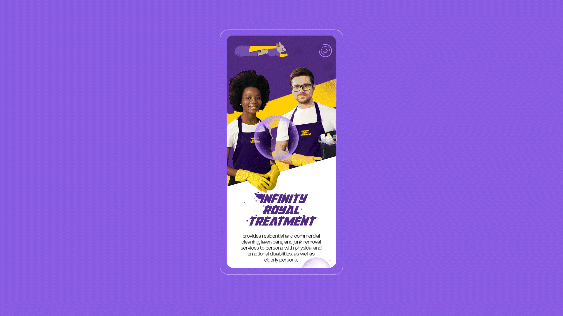
Website
+ We used a clean and modern design for the website, ensuring easy navigation and a visually appealing user experience UX.
+ We showcased the brand's story, motivations, services, and contact information on the website to build trust and engage with the audience.
"
We are impressed with the logo and the website. We really loved the concepts and the execution of the project. We just love it all!
"
Terrel Bailey