Hyperyze is a tech start-up in the automation space, in a new area called hyperautomation, a blend of robotic Process Automation (RPA), Machine Learning (ML) and Artificial Intelligence (AI), using technology to free staff up from manual boring work to focus on projects that are more engaging, so making companies more productive.
Objective:
To create full visual branding and website that clearly and effectively communicated their brand, services, USP, message, values, and feel.
Problem/Challenge
Branding
Upon beginning of the project, the company had no visual branding in place and our job was to complete create it, showing the uniqueness in what they did, hyperautomation, a completely innovative concept that strives not only more efficiency, but focuses on employees working on more engaging, creative, and beneficial tasks for a company, especially SMEs that have always missed the power of these tools due to their expensive prices.
Website
Upon beginning of the project, the company had no visual branding in place and our job was to complete create it, showing the uniqueness in what they did, hyperautomation, a completely innovative concept that strives not only more efficiency, but focuses on employees working on more engaging, creative, and beneficial tasks for a company, especially SMEs that have always missed the power of these tools due to their expensive prices.

Solutions
Branding
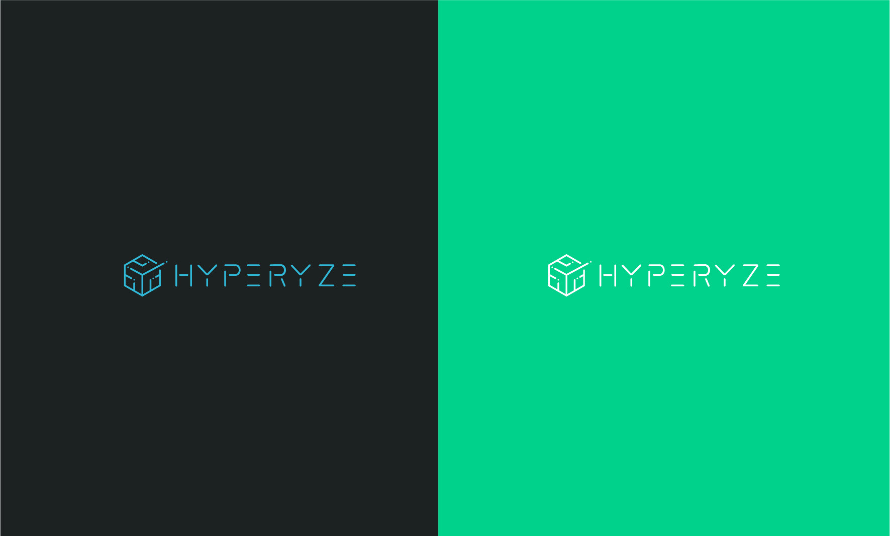
Logo
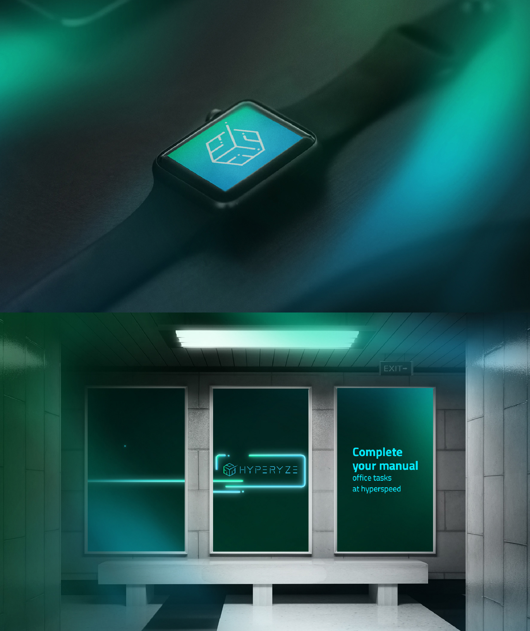
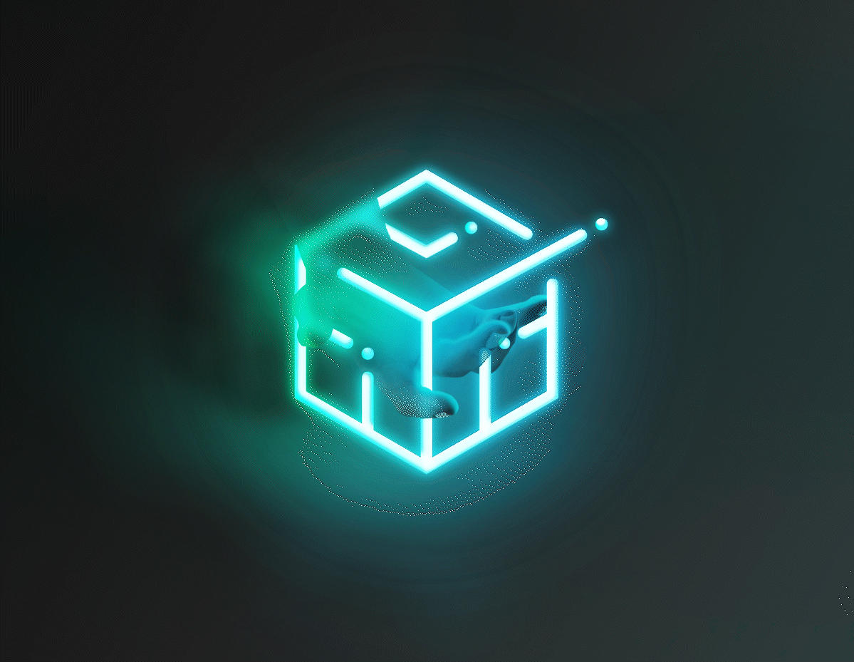
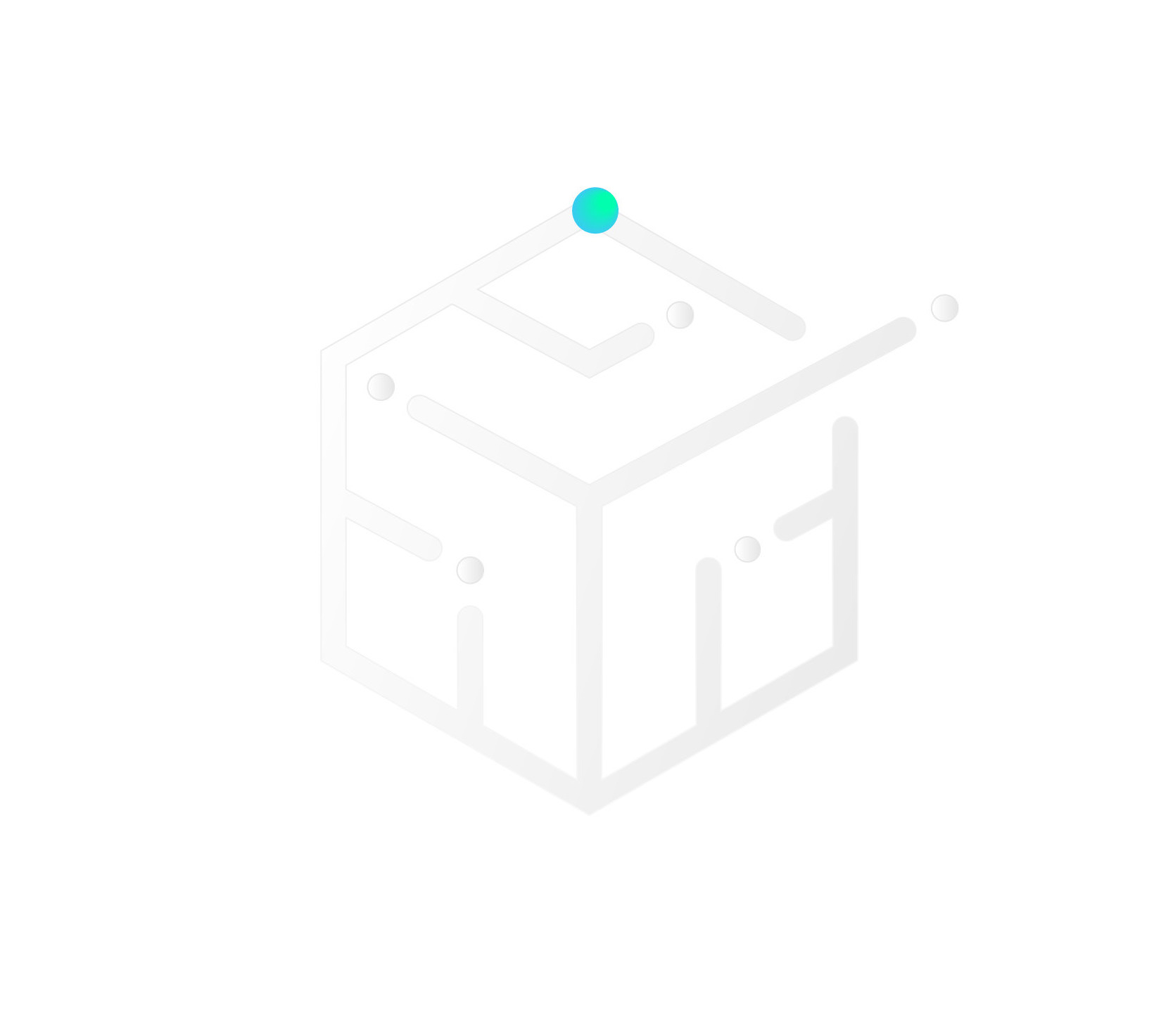
We created a clean, simple, and futuristic look, including the vision of black and the theme of speed, and the speed of sound. We created a figure inspired by Machine Learning and its trial-and-error method. For this, we conceptualized AI nodes exploring different ways, through AI conductors, and discovering different results. This also emphasized the transmission of large amounts of data, which is a key element of hyperautomation.

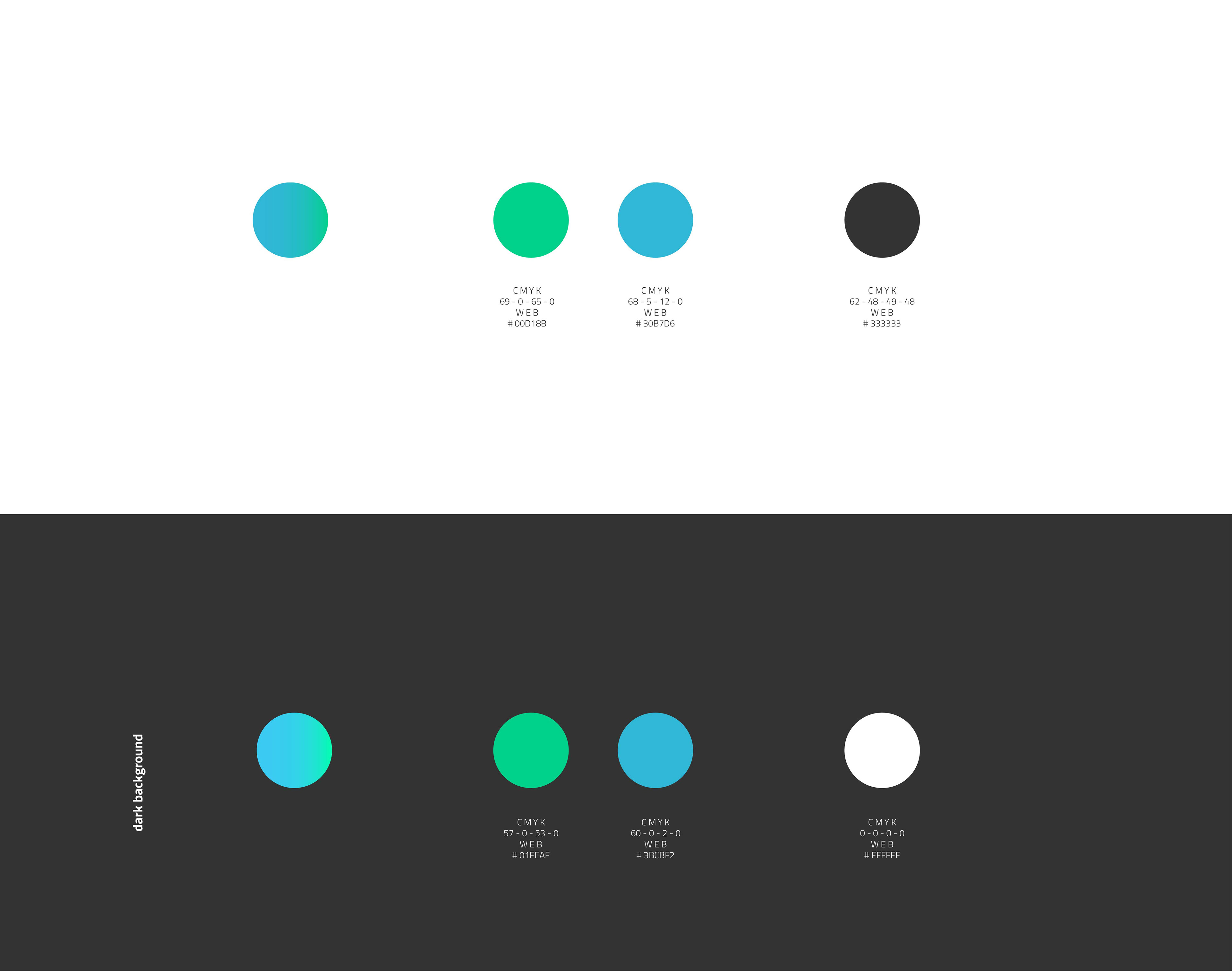
Color palette
The color #00D18B (for light backgrounds) and #01FEAF (for dark backgrounds) are vibrant shades of green that infuse Hyperyze with a sense of futuristic modernity and a clean aesthetic, capturing the essence of freshness, growth, and innovation.
Correspondingly, #30B7D6 and #3BCBF2 are shades of blue that show reliability, clarity, and a forward-thinking vision.
Using these colors separately or blended (gradient) produces a bold and vibrant vibe. When put in contrast with white, #FFFFFF, and #333333, a deep shade of gray, the accent colors instantly draw the attention of the viewer, and the whole color palette creates a memorable and balanced look.
Font
To achieve a futuristic, modern, and clean look and feel for Hyperyze, we utilized the Titillium Web font. One of the reasons to choose it for this brand lies in its legibility. Its well-defined letterforms and ample spacing between characters make it highly readable, even at small sizes. Its modern and geometric design perfectly suits contemporary and minimalist aesthetics, while its clean lines and simple curves convey a sense of sophistication and professionalism.

Website
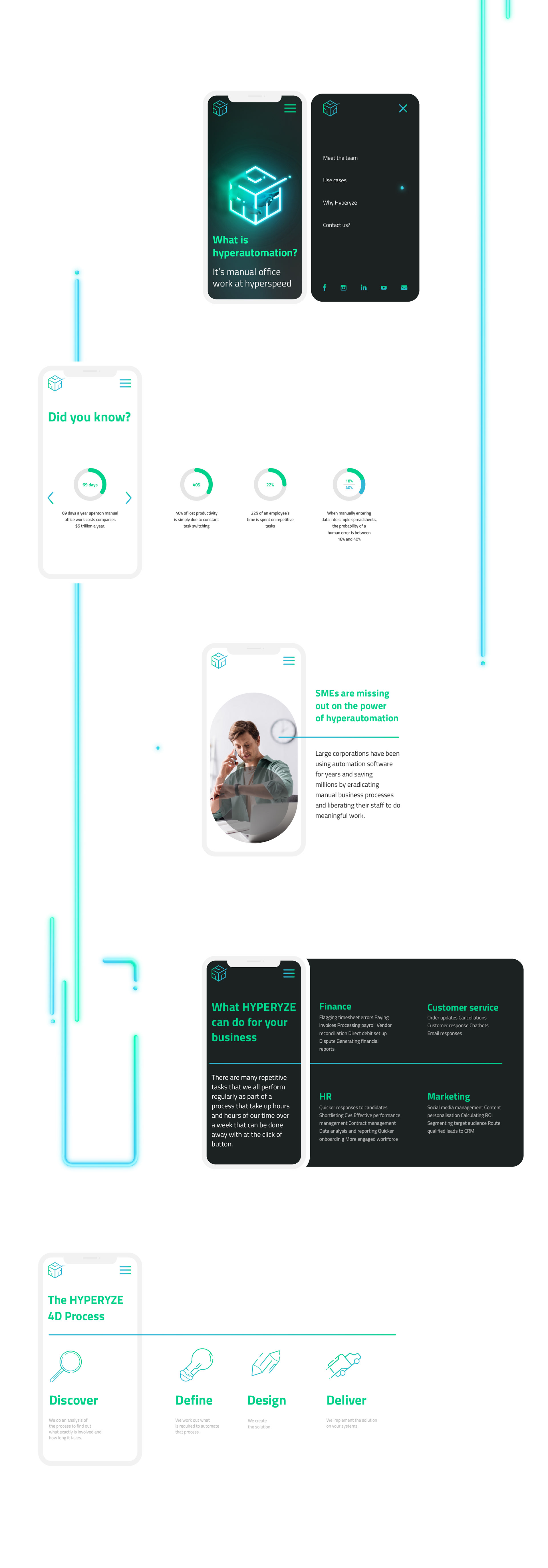
The layout shows the information in different blocks and makes the user understand the product and company step by step. We focused on creating an excellent UX, so the audience would feel attracted and curious about the futuristic shapes first, using pie charts to show information in percentages,
bulletpoints, imagery, iconography, and of course, a simple, clean, and balanced layout with the right use of white space, connecting all the sections of the website with branded shapes and figures (nodes and conductors) leading to the next section of the page. Permanently using these elements stresses the brand's consistency.
Praise
Very attentive from the start. They gave me solid feedback on my brief which was very valuable. They spent a lot of time understanding my brand and came up with an exciting design. I will be using Brutko's services again.
Stephen Flanagan